According to a Google Photos usage report, over 82% of travel photos never get viewed again after the trip ends — they sit buried in camera rolls, unsorted and forgotten. The difference between a forgettable photo dump and a compelling travel slideshow comes down to intentional shot selection. Choosing the best photos for travel slideshows transforms your travel memories into visual stories that hold an audience's attention from first frame to last. Whether you're presenting to family, clients, or your photography community, the right mix of image types creates rhythm, variety, and emotional resonance that single-genre collections simply cannot match. For a deeper dive into building your photography toolkit, explore our ultimate guides collection.
The secret that experienced travel photographers understand is that slideshows aren't just collections — they're narratives. You need establishing shots that set the scene, detail shots that pull viewers in close, and candid moments that deliver emotional weight. Mixing these deliberately keeps your audience engaged instead of glazing over after slide twelve.
In this guide, you'll learn exactly which five photo types belong in every travel slideshow, how to shoot them with intention, and the common pitfalls that turn promising presentations into tedious marathons. Every recommendation here comes from real-world slideshow presentations — not theory.
Contents
Where Each Photo Type Fits in Your Slideshow
Understanding where the best photos for travel slideshows fit within your presentation structure is the foundation of a compelling sequence. Each type serves a distinct narrative purpose — skip one, and your slideshow develops gaps that audiences feel even if they can't articulate why.
Landscape and Establishing Shots
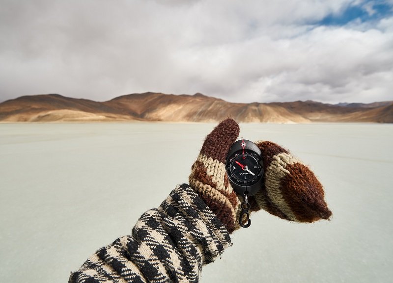
These are your scene-setters. A wide landscape shot tells your viewer exactly where they are before you pull them into the details. Place these at the beginning of each location segment in your slideshow to orient the audience.
- Shoot during golden hour or blue hour for maximum visual impact — flat midday light rarely impresses on screen
- Include a foreground element to create depth and draw the eye through the frame
- Use a tripod and shoot at f/8 to f/11 for front-to-back sharpness
- Capture both horizontal and vertical orientations so you have flexibility in your slideshow layout
If you're serious about nailing these shots, our guide on shooting landscape photography at sunrise covers the technical approach in detail. The discipline of chasing early light pays massive dividends in slideshow quality.
Street and Candid Photography
Street photos inject life into your slideshow. They capture the energy, pace, and human texture of a destination in ways that landscapes alone never will. A vendor preparing food, children playing in a plaza, commuters rushing through a train station — these images make your audience feel present.

Shoot with a 35mm or 50mm equivalent lens for natural perspective. Keep your shutter speed at 1/250s or faster to freeze motion. For location ideas and techniques, check out our piece on places to start your street photography journey.
Architecture and Cityscape Details
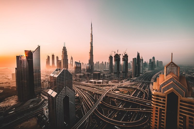
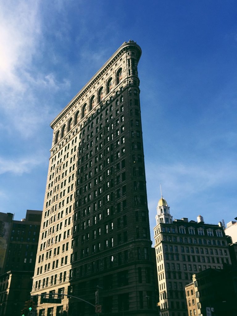
Architecture shots bridge the gap between wide establishing shots and intimate close-ups. They showcase the character of a place — ornate doorways, modern skylines, weathered walls — and work as visual breathing room between high-energy candid images.
Pro tip: Alternate between wide cityscapes and tight architectural details within your slideshow. Three wide shots in a row creates visual fatigue; a close-up of a carved stone detail resets the viewer's attention.
Our cityscape photography tips guide covers the technical side of capturing urban environments with precision. Pay special attention to vertical lines — correcting converging verticals in post makes a significant difference in slideshow presentation.
Food and Cultural Close-Ups
These are the sensory images. A steaming bowl of pho, spices piled in a market stall, hands weaving textiles — close-up cultural images engage different parts of the brain than landscapes do. They trigger memory and imagination simultaneously.
- Shoot with a wide aperture (f/2.8 to f/4) for shallow depth of field that isolates your subject
- Use natural window light when possible — overhead fluorescent lighting kills food and detail shots
- Get close enough that texture becomes visible: grain in wood, glaze on pottery, steam rising from food
Group and Portrait Moments
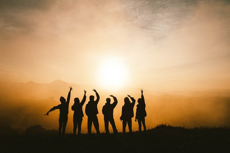
People are what make travel personal. Include portraits of travel companions, locals who invited you into their world, and group moments that anchor the emotional narrative. These images remind your audience that travel is fundamentally about human connection.
Shoot portraits at eye level. Use a longer focal length (85mm to 135mm equivalent) for flattering compression. And always ask permission — a genuine smile beats a stolen shot every time.
Quick Comparison: Photo Types at a Glance
When you're assembling the best photos for travel slideshows, understanding how each type functions within the whole saves you hours of trial-and-error sequencing. This table breaks down the core attributes.
| Photo Type | Best Lens Range | Slideshow Role | Ideal Placement | % of Total Slides |
|---|---|---|---|---|
| Landscape / Establishing | 16–35mm | Scene-setter | Opening of each segment | 20–25% |
| Street / Candid | 35–50mm | Energy and rhythm | Mid-segment clusters | 20–25% |
| Architecture / Cityscape | 24–70mm | Visual breathing room | Between candid and detail shots | 15–20% |
| Food / Cultural Close-Up | 50–100mm | Sensory engagement | Scattered throughout | 15–20% |
| Group / Portrait | 85–135mm | Emotional anchor | Segment endings | 15–20% |
When to Prioritize Each Type
Your audience dictates the balance. Presenting to fellow photographers? Lean heavier on landscapes and architecture where technical skill shines. Sharing with family? Increase the ratio of group shots and candid moments. Client presentations for a travel brand? Food and cultural close-ups often carry the most commercial weight.
Ideal Ratios for Different Audiences
There's no universal formula, but a reliable starting ratio is 25% landscapes, 25% street, 20% architecture, 15% close-ups, and 15% portraits. Adjust from there based on your destination and audience. A trip to Tokyo might skew heavily toward architecture and food; a safari in Kenya naturally favors landscape and candid wildlife-adjacent moments.
Shooting Tips to Keep Your Slideshow Images Fresh
Having all five photo types is necessary but not sufficient. You also need variety within each category to prevent visual repetition. Here's how to keep your slideshow feeling dynamic from start to finish.
Varying Your Composition
The fastest way to make a slideshow feel stale is shooting every image from eye level with centered composition. Break the pattern deliberately.
- Alternate between leading lines compositions and rule-of-thirds framing
- Shoot from ground level, overhead, or through foreground frames to create visual surprise
- Mix orientations — a vertical shot after three horizontals refreshes the viewer's eye
- Include at least one intentionally minimal or negative-space image per location segment
Maintaining Lighting Consistency
Nothing pulls a viewer out of a slideshow faster than jarring exposure or white balance shifts between consecutive slides. You don't need identical lighting — you need consistent tonal treatment.
Shoot in RAW so you have full control over white balance in post-processing. During editing, apply a base preset across all images from a single location, then fine-tune individually. Our free Lightroom presets collection offers starting points that unify diverse lighting conditions under a cohesive look.
Curating and Editing for Maximum Impact
You shot 3,000 photos on a two-week trip. Your slideshow needs 60 to 80 images. That means cutting roughly 97% of what you captured. This is where most photographers struggle — and where the best slideshows are actually made.
The Culling Process
Cull in three passes. First pass: flag everything that's technically sharp with decent exposure — this eliminates the obvious rejects. Second pass: within each photo type, select only the strongest composition. Third pass: sequence your selections and remove any image that doesn't advance the narrative or creates redundancy with adjacent slides.
- Never include two similar shots of the same subject — pick the stronger one and delete the other from consideration
- Apply the "three-second rule": if an image doesn't communicate something within three seconds of appearing on screen, cut it
- Aim for 4 to 6 images per day of travel as a maximum
Insider observation: The single biggest difference between amateur and professional travel slideshows isn't image quality — it's editing ruthlessness. Pros cut 98% of their shots. Amateurs cut 50% and wonder why the slideshow drags.
Consistent Color Grading
Your slideshow should feel like it was shot through a single visual lens, even if lighting conditions varied wildly. A unified color grade ties everything together. Warm tones for Mediterranean trips, cooler grades for Nordic destinations, or desaturated earth tones for desert landscapes — pick a palette and commit to it.
Sync your base adjustments in Lightroom, then use the HSL panel to fine-tune skin tones in portraits without affecting your landscape grade. This two-layer approach gives you consistency without sacrificing accuracy where it matters most.
Common Mistakes That Ruin Travel Slideshows
After reviewing hundreds of travel slideshows over the years — from photography club presentations to professional portfolio reviews — the same mistakes keep surfacing. Here's what to avoid.
The Over-Inclusion Trap
This is the number-one slideshow killer. You're emotionally attached to images because of the experience behind them, not because of their visual merit. That sunset you waited two hours for? If the composition is weak, it doesn't belong in the slideshow. Period.
- Cut any image where the story requires verbal explanation — if the photo can't communicate on its own, it's not slideshow material
- Remove consecutive shots of the same subject from slightly different angles
- Eliminate "record shots" — images that document something happened without artistry
The slideshow format demands economy. Each image earns its spot or gets cut.
Ignoring Narrative Flow
Dumping images in chronological order is lazy sequencing. Your slideshow should flow like a visual essay: wide to tight, calm to energetic, then back again. Treat transitions between images the same way a film editor treats cuts — each transition should feel intentional.
Group images by location or theme rather than timestamp. Open each segment with an establishing landscape, build through street and architectural shots, peak with your strongest detail or portrait image, then transition to the next location. This creates natural pacing that holds attention.
Troubleshooting Weak Slideshows
You've assembled your slideshow, run through it once, and something feels off. It's flat, or it drags in the middle, or the ending falls apart. Here's how to diagnose and fix the most common problems.
Fixing Flat or Monotonous Sequences
If your slideshow feels monotonous, the issue is almost always insufficient variety across the five photo types. Count how many consecutive images share the same type. More than three in a row of any single category creates a visual plateau.
- Interleave photo types: landscape → candid → detail → architecture → portrait
- Vary image orientation every 3 to 4 slides
- Insert one "pattern-breaker" image per 15 slides — something unexpected that snaps attention back: an extreme close-up, an abstract texture, or a silhouette
- Check your pacing by watching the slideshow at double speed — flat sections become immediately obvious
Sometimes the fix isn't adding images but removing the wrong ones. If you have eight landscape shots and two portraits, your slideshow will feel like a screensaver. Rebalance according to the ratios in the comparison table above.
Technical Quality Fixes
Technical issues that are invisible at web resolution become glaring on a projected screen or large display. Before finalizing your slideshow, check every image at 100% zoom for these problems:
- Soft focus — especially common in street and candid shots where you're shooting fast
- Blown highlights in skies — recoverable in RAW, but check your processing
- Noise in shadow areas — apply targeted noise reduction in Lightroom's masking tools
- Color casts from mixed lighting — use the white balance eyedropper on a neutral surface
- Sensor dust spots — run spot removal across all images before export
Export at the native resolution of your display medium. For projected slideshows, 3840×2160 pixels is the current standard. For web-based slideshows, 1920×1080 is sufficient. Over-compressing JPEGs for smaller file sizes introduces artifacts that are visible on large screens — keep quality at 90% or higher.
Frequently Asked Questions
How many photos should a travel slideshow contain?
Keep your slideshow between 60 and 100 images for a 10 to 15 minute presentation. At roughly 8 to 10 seconds per slide with transitions, this creates a comfortable viewing experience without losing your audience's attention. For shorter presentations at photography clubs or portfolio reviews, trim to 30 to 40 of your absolute strongest images.
What's the best software for creating travel photo slideshows?
Lightroom's built-in slideshow module handles most needs and keeps your workflow inside a single application. For more advanced control over transitions, timing, and music synchronization, ProShow Gold and FotoMagico are professional-grade options. If you're presenting on the web, tools like Pixieset or SmugMug offer clean, responsive slideshow galleries with client-sharing features.
Should I include video clips in a photo slideshow?
Short video clips of 5 to 10 seconds can add powerful texture — crashing waves, bustling markets, or wildlife in motion. Use them sparingly: no more than 3 to 4 clips in an 80-image slideshow. Place them at transition points between location segments where the motion serves as a palate cleanser between static images. Ensure the video resolution matches your photo export quality.
Next Steps
- Audit your last travel shoot. Sort your images into the five categories (landscape, street, architecture, close-up, portrait) and check whether any type is missing or underrepresented. Identify the gaps you need to fill on your next trip.
- Build a 40-image practice slideshow. Pick your strongest images from a single trip, sequence them using the wide-to-tight pacing structure outlined above, and watch it through twice — once for flow and once for technical quality at full zoom.
- Create a shot checklist for your next trip. Before you leave, write down the five photo types and commit to capturing at least 10 strong candidates in each category per location. Having the list in your camera bag keeps you intentional when shooting fatigue sets in.
- Establish a consistent editing preset. Develop or download a base Lightroom preset that defines your slideshow look — white balance tendency, contrast curve, and color palette. Apply it to every image first, then fine-tune individually.
- Present to a test audience. Show your slideshow to one person before the real presentation. Watch their body language: where they lean in, where they check their phone. Cut or replace every slide that loses them.
 |
 |
 |
 |

About Alex W.
Alex is a landscape, equine, and pet photographer based in the Lake District, UK, with years of experience shooting in one of Britain's most photographically demanding natural environments. His work has been featured in Take a View Landscape Photographer of the Year, Outdoor Photographer of the Year, and Amateur Photographer Magazine — publications that reflect a serious, competitive standard of image-making. At Click and Learn Photography, he shares the camera settings, gear choices, and compositional techniques he has developed through real-world shooting and competition-level work.
You can Get FREE Gifts. Furthermore, Free Items here. Disable Ad Blocker to receive them all.
Once done, hit anything below
|
|
|
|